-
CENTRES
Progammes & Centres
Location
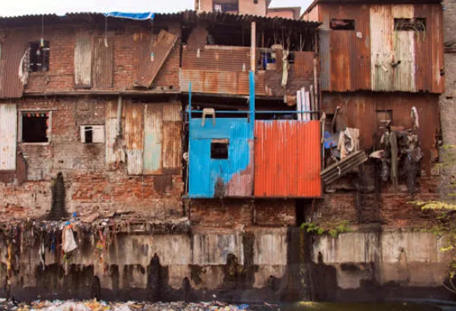
The face of poverty changes asymmetrically across the states. Monitoring systems must be flexible enough to map the poor and come up with targeted plans for managing deprivation
The government did well to publish the NITI Aayog Report on Multidimensional Poverty (2019-21), highlighting the decline in the poverty headcount from around 24.85 percent in 2015-16 to 14.96 percent in 2019–2021—showcasing a substantial fall from the earlier survey outcomes. Both are based on the data collected during the standardised National Health Status Reports for the relevant years.
Managed by NITI Aayog in technical collaboration with the Oxford Poverty and Human Development Initiative and the UNDP, the report has the virtue of a detailed state-level dissection of the status of poverty, which is commendable and evokes thinking around the need for contextual grassroot-level initiatives if poverty is to be managed.
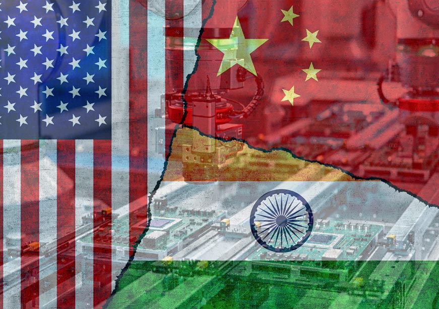
In some ways, the task is even more formidable now than in the go-go years of global expansion (1980 to 2007). Economies like India, with large populations and lower middle-level per capita incomes, are likely to be hard-pressed to provide the necessary outlays for compressing poverty ratios further.
Technological advances, automation, Artificial Intelligence (AI), and bionics to extend productive life, could freeze the net addition of productive global jobs putting household income at risk.
India’s population is projected to increase by around 250 million by 2050 1412 million in 2022 to 1662 million, reinforcing our “largest global population tag”. To be sure, an extension of the youthful profile could be an asset—a profile China is now trying desperately to recreate. But young populations need to work. Uncertainty prevails over the future of work. Technological advances, automation, Artificial Intelligence (AI), and bionics to extend productive life, could freeze the net addition of productive global jobs putting household income at risk.
This report is prescient in presenting a flexible tool to identify the poor in a contextual manner and to assess the intensity of deprivation. It trawls the NHS 4 and NHS 5 data to identify how households (HH) score on each of the 12 indicators identified as proxies for poverty—as listed in the table below. Scoring for each indicator is on a binary basis—a score of 1 if the HH is deprived in the indicator and 0 if it is not. So, if a HH did not use coal, or biomass or Agri-residue for cooking they scored 0, and they scored 1 if they did use these fuels because using these cooking fuels is a proxy for deprivation. Similarly, either they had access to grid electricity (score 0), or they were deprived and scored 1.
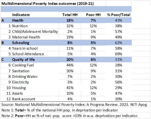
A weight is attached to each indicator to discriminate across them depending on their relevance to poverty-driven deprivation. For instance, the highest weight (0.17) is attached to each of the two indicators for education. The next higher weight (0.11) is attached to each of the three health indicators and the lowest weight (0.05) is for each of the seven indicators in quality of life. Each dimension (Health, Education and Quality of Life) has an equal weight of 33.33 percent. The variation in the number of indicators under each dimension, explains the difference in weightage across indicators. This is sensible and intuitive. Using modern cooking fuel or having a private toilet is certainly less of a poverty indicator than getting your child educated or having access to health services.
Each HH’s score for each indicator (1 or 0) is adjusted by the defined weight of each indicator (0.17, 0.11, or 0.5). The weighted score for each indicator is then aggregated across all 12 indicators for each HH. If an HH qualifies in each indicator, it will score 100 percent on deprivation. But a lower bar of 33 percent or higher is applied to define the poor. Are we then overestimating the poor by allowing some non-poor to get statistically included?
The methodology strives towards being inclusive rather than being statistically rigid at the risk of excluding some poor. The furore around Aadhar becoming the single verification point for the poor to access subsidised food, highlights that inclusivity with acceptable levels of misidentification is a practical way to go in poverty reduction programmes.
The face of poverty will change asymmetrically across the states and monitoring systems must be flexible enough to map the poor, assess the extent of deprivation, and come up with targeted plans for managing deprivation.
This methodology is not as rigid as the “Union” method, which requires the poor to qualify in all the indicators—leading to the risk of underestimating poverty. Nor is it as liberal as the “Intersection” method which requires the poor to just qualify in any one indicator, thereby, resulting in possible overestimation.
The Alkire-Foster methodology accepts that poverty is contextual and barriers to ending poverty can vary across jurisdictions. It allows for contextual priorities in ending poverty to be factored in. The fact is, poverty never ends. It just changes how it manifests. There is no one template to define the poor. This is a lesson India must internalise, as per capita incomes increase beyond the lower middle levels. The face of poverty will change asymmetrically across the states and monitoring systems must be flexible enough to map the poor, assess the extent of deprivation, and come up with targeted plans for managing deprivation.
Some issues remain unanswered. First, it remains unclear how the headline poverty headcount of 14.96 percent poor HH was derived. The Table shows that for each of the 12 indicators, poor HH, as a proportion of the national population, range between a low of 1 to 12 percent. We also know that the aggregate weighted score across all indicators should be a minimum of 33 percent to qualify as a poor HH. So HH must qualify across several indicators and across dimensions to reach the weighted average score of 33 percent or qualify across all indicators in any of the three dimensions—each of which has a weight of 33.33 percent. It remains unclear how the average of a series of numbers ranging between 1 to 12 can become 14.96.
Second, till now poverty headcounts were expressed as the proportion of poor individuals in the population. The MDPI methodology scores HH and not individuals. All members of an HH are assumed to have similar socio-economic metrics. How then would this outcome be consistent with the earlier work on poverty? Poor HHs are larger than richer ones. Assuming a difference of 20 percent (5 persons per poor HH and 4 persons per non-poor HH), the actual number of individuals in poverty today would be 18 percent and not 15 percent as reflected in the present survey. Also, earlier work estimating poverty was based only on consumption data—a “Union” approach. A data bridge would need to be designed by statisticians to enable long-term comparisons of poverty trends across these separate datasets.
The poor form significant numbers of those in need of higher levels of assistance in health and education. They comprise 62 percent of HH not meeting the minimum norms prescribed for schooling and 43 percent of the HH not receiving the minimum level of health support. Both failures of public administration have long-term adverse effects on the quality of life and the quality of future generations. This is hardly the kind of drawback India can afford at a time when the supply of a skilled and competitive workforce will be the keystone for economic success.
Both failures of public administration have long-term adverse effects on the quality of life and the quality of future generations.
Under the dimension “Quality of Life”, the poor seem most disadvantaged in access to electricity (they comprise 56 percent of those HH without access). This calls into question the extent of electrification achieved at the ground level with around 9 million HH yet to be electrified of which around two-thirds are poor. Under the “assets” indicator, 47 percent do not possess a single asset out of a telephone, radio, TV, refrigerator, computer, animal cart, bicycle, motorcycle, or car. Digital health would remain an elitist programme if 28 million HH do not even have a phone of which half are poor.
The MDPI is a good way to track results in government programmes aimed at ending poverty. But one wonders if the complexity of the task of monitoring 12 different indicators is necessary to understand whether poverty trends. The old method of using NSSO consumption levels as a proxy for poverty retains intuitive appeal.
Under the MDIP approach, too much depends upon the efficiency with which governments extend targeted support, even in private goods like consumer durables, housing, and so on. The delivery of merit goods for free and their quality is tough to monitor. It also encourages the backdoor entry of inept indicators of merit goods, like a flush latrine without a known effluent discharge (even if it discharges into a drinking source downstream), possession of which under “sanitation” disqualifies the poverty tag.
Governments seek to ameliorate the misery of the poor quickly by providing them merit goods for free. In doing so, they also strip them of their dignity. Charity is a necessity in desperate times. Institutionalising it, as an acceptable way of life, is self-defeating.
Sanjeev Ahluwalia is an Advisor at the Observer Research Foundation.
The views expressed above belong to the author(s). ORF research and analyses now available on Telegram! Click here to access our curated content — blogs, longforms and interviews.
Sanjeev S. Ahluwalia has core skills in institutional analysis, energy and economic regulation and public financial management backed by eight years of project management experience ...
Read More +